Designed a guided shopping experience that helped Walmart customers navigate complex coffee maker purchases,
resulting in conversion rates that exceeded goals by 0.5%.
Role
Product Designer
Client
Walmart · Keurig
Timeline
6 Months
Status
Shipped
Background
The problem space
Eko specializes in interactive video experiences. I was hired to work on their Walmart account
to help create a platform that guides their customers to make better decisions about their purchases.
The first vertical they decided to explore was coffee makers, which would create the architecture
for future verticals. The first brand they partnered with was Keurig.
Walmart's Goals
Help people find the best product for them
Drive more traffic to PDP pages
Reduce cart abandonment
Eko's Goal
Drive as much traffic as possible. The main metric for this project was conversion
from our experience to the Product Detail Page.
The Challenge
A small problem with big impact
Walmart provided initial user research and numbers. Cart abandonment was higher than industry
average for both desktop and mobile. Those small differences in percentages can mean millions
of dollars as the coffee market in the US is ~$7.55 Billion annually.
Desktop
Mobile
Industry Average
69.57%
85.65%
Walmart Coffee Makers
71.23% (+1.66%)
88.1% (+2.46%)
I was tasked to help increase the percentage of conversion from our experience to Walmart's
Product Detail Page. The goals: increase desktop conversion from 2.1% to 3.0% (+0.9%),
and mobile from 0.9% to 3.0% (+2.1%).
Research
Understanding the customer
I conducted eight in-depth interviews using a prototype, targeting 30-45 year old home coffee
drinkers planning to buy a machine in the next 3 months. All participants were Walmart shoppers
and the key decision-maker for their household.
✓
Experience Seemed Helpful
The tool narrowed down options and saved time. Users appreciated having a guided starting
point when they didn't know what they were looking for.
✓
Felt More Guided
The host seemed credible and provided helpful tips without being overbearing. Users felt
they were being helped to make an informed decision, not forced.
✗
Too Ad-Like
5 out of 8 participants thought it felt like an advertisement and not catered to their
specific needs. Some felt like they hit a dead end.
✗
Wanted More Choices
Users were confused that they only saw one suggestion at the end. They expected to see
a range of choices to compare.
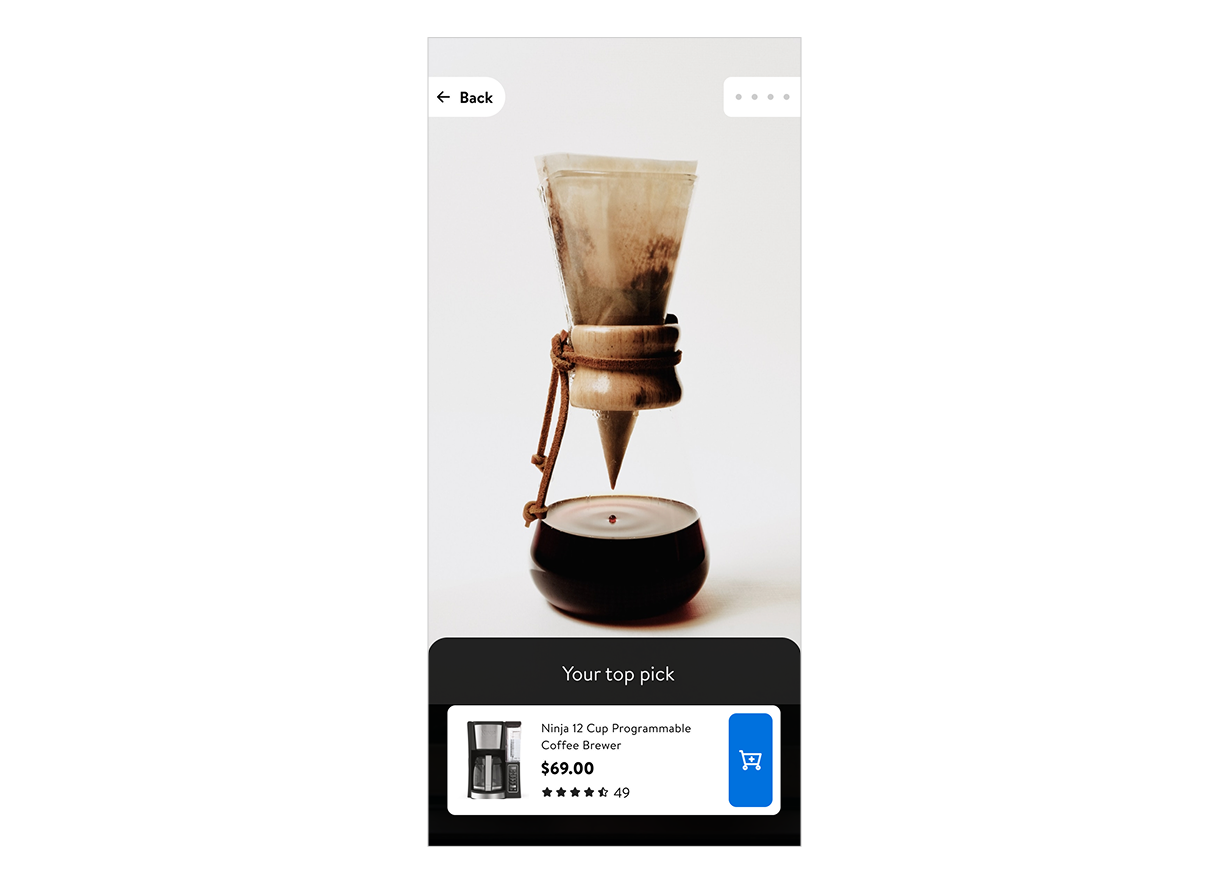
"I was confused that I only saw one suggestion at the end. I was expecting to see a range of choices."
— Ian, 44, Research Participant
Initial design showing one highly-targeted recommendation
Design Process
Finding the right balance
Based on the feedback, finding the correct amount of recommendations was critical. I ran a
series of smaller tests with 3 different versions to determine the optimal number of products
to display.
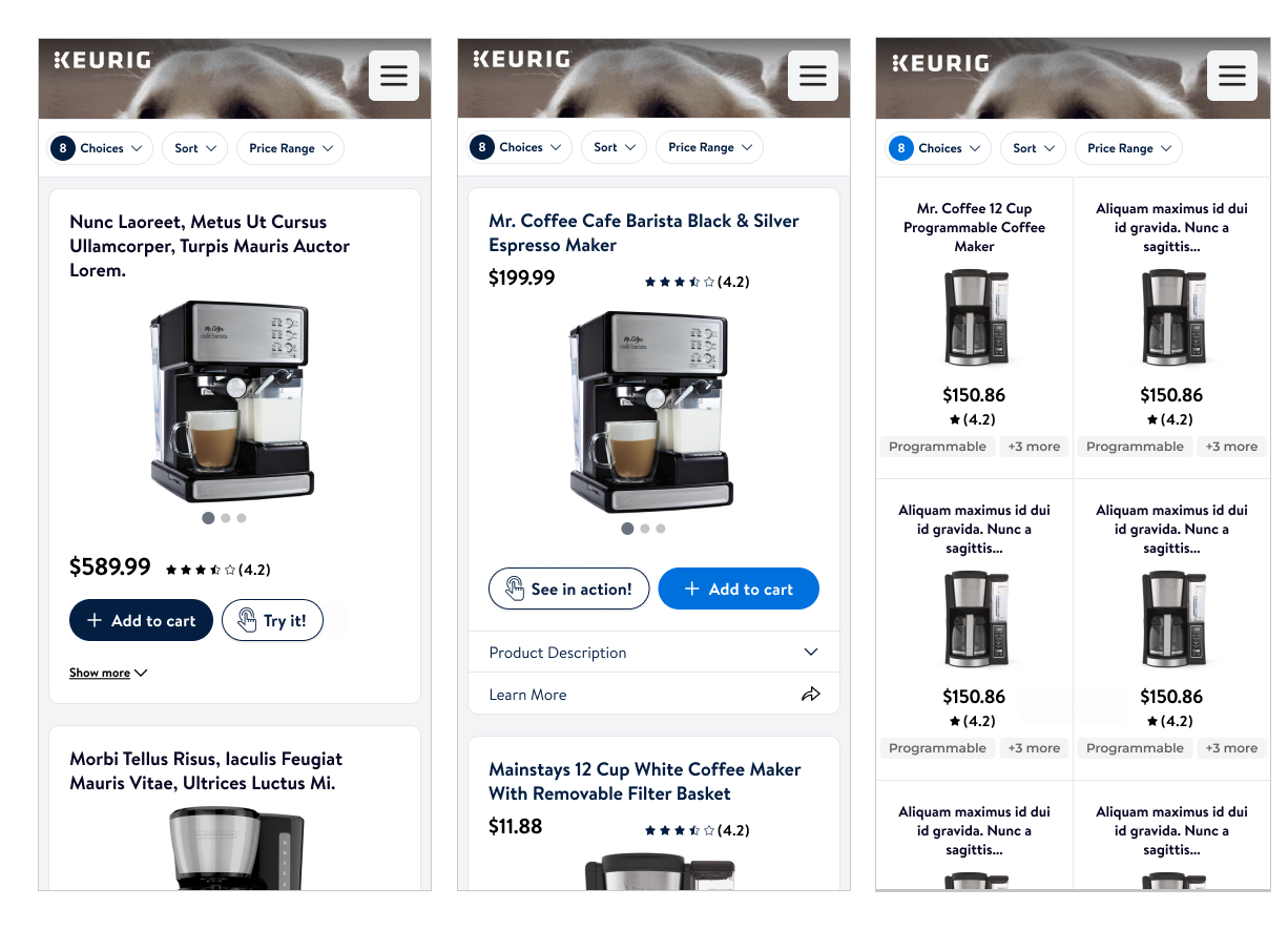
Expanded view with three different recommendations for comparison
The shipped version with optimized recommendations and smooth transitions
Results
Impact of updated experience
After a few iterations, the effort was worth it. The desktop version exceeded our goals,
while mobile fell slightly short and became the next point of focus.
3.5%
Desktop Conversion
+0.5% above goal
2.6%
Mobile Conversion
-0.4% below goal
17%
Overall Improvement
Desktop results
Takeaways
What I learned
This project reinforced the importance of balancing speed with depth in user research.
Quick experiments have their place, but knowing when to invest in proper user testing
is what separates good outcomes from great ones.
Lesson 01
Quick, low-cost experiments are valuable, but there's a point where connecting
with actual users becomes essential for breakthrough insights.
Lesson 02
User testing candidates who meet all criteria of potential users provide dramatically
better insights than convenience samples.