Three modernization projects delivered over 12 months for APQC, a leading nonprofit
benchmarking organization: site navigation, customizable forms, and course catalog.
Role
UX/UI Designer
Client
APQC · Tag1
Timeline
12 Months
Status
Shipped
The Challenge
Modernizing a complex digital ecosystem
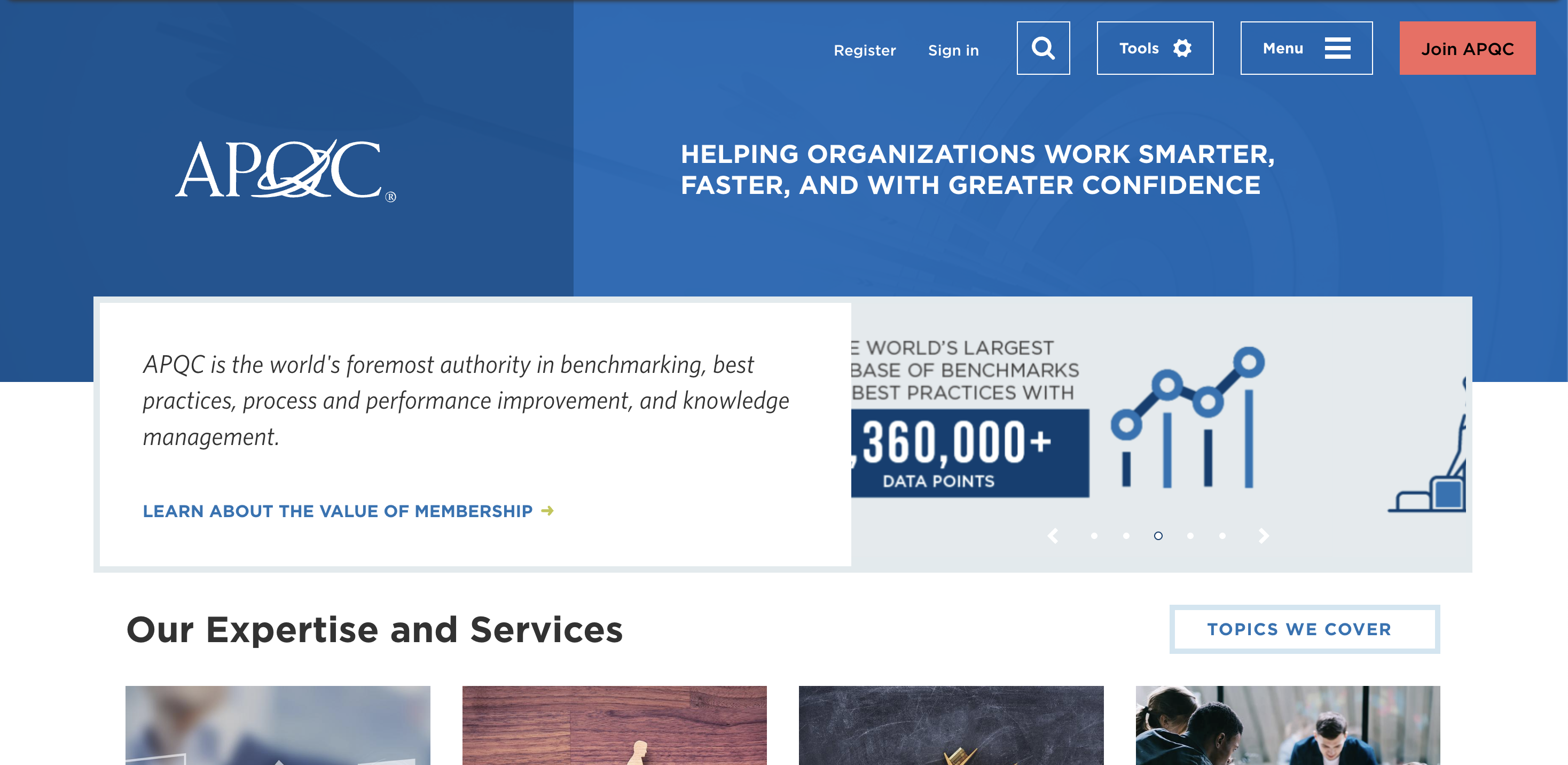
APQC.org serves thousands of member companies across nearly every industry, from Fortune 1000
organizations to consultants, researchers, and process managers. These members rely on APQC
for benchmarking data, best practices, training, and frameworks like the Process Classification
Framework (PCF).
Working with Tag1 Consulting, I led the UX/UI design across three distinct modernization projects
over the course of a year. Each project addressed a different touchpoint in the member experience:
how they navigate the site, how they discover and purchase courses, and how they engage with APQC
through forms.
The Work
Three projects, one designer
As Tag1's embedded design partner for APQC, I worked across three distinct projects that
spanned different parts of the member experience. Each required different approaches, but all
shared a commitment to clean, accessible, user-centered design.
Project 01
Main Navigation
Redesigned site-wide navigation to improve findability, meet AA accessibility standards,
and showcase APQC's full range of research, tools, and training offerings
Project 02
Course Catalog
Transformed how members discover and purchase courses with filtering, detailed landing pages,
and streamlined checkout for self-paced, live virtual, and in-person training
Project 03
Customizable Forms
Modernized website forms with flexible templates for membership, registration, lead magnets,
contact requests, and custom training inquiries
Process
Research, design, validate
I worked closely with a UX researcher and APQC stakeholders through a structured discovery and
design process. We conducted stakeholder interviews, reviewed analytics, examined industry best
practices, and validated our designs with both internal and external users.
The validation testing included five participants, two internal stakeholders and three APQC
members with varying levels of site experience. All participants successfully navigated the
redesigned system and found content easily through the new structure.
Navigation
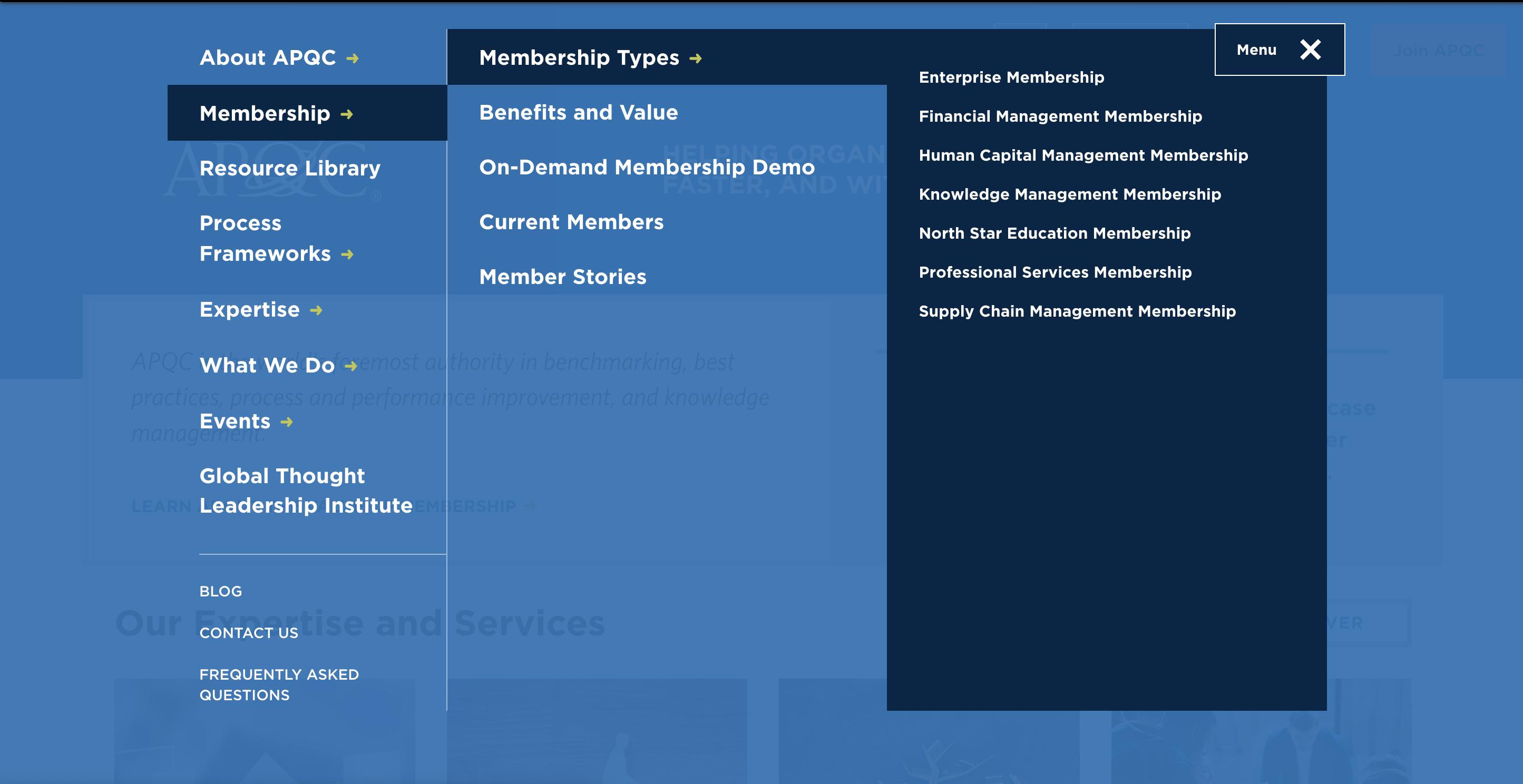
Improving discoverability and hierarchy
The navigation redesign addressed three core problems: key sections hidden behind hamburger menus,
the resource library buried within nested menus, and search functionality scattered without clear
hierarchy. The solution creates visible, scannable navigation that meets AA accessibility standards.
The old navigation suffered from a lack of discoverability and hierarchy.
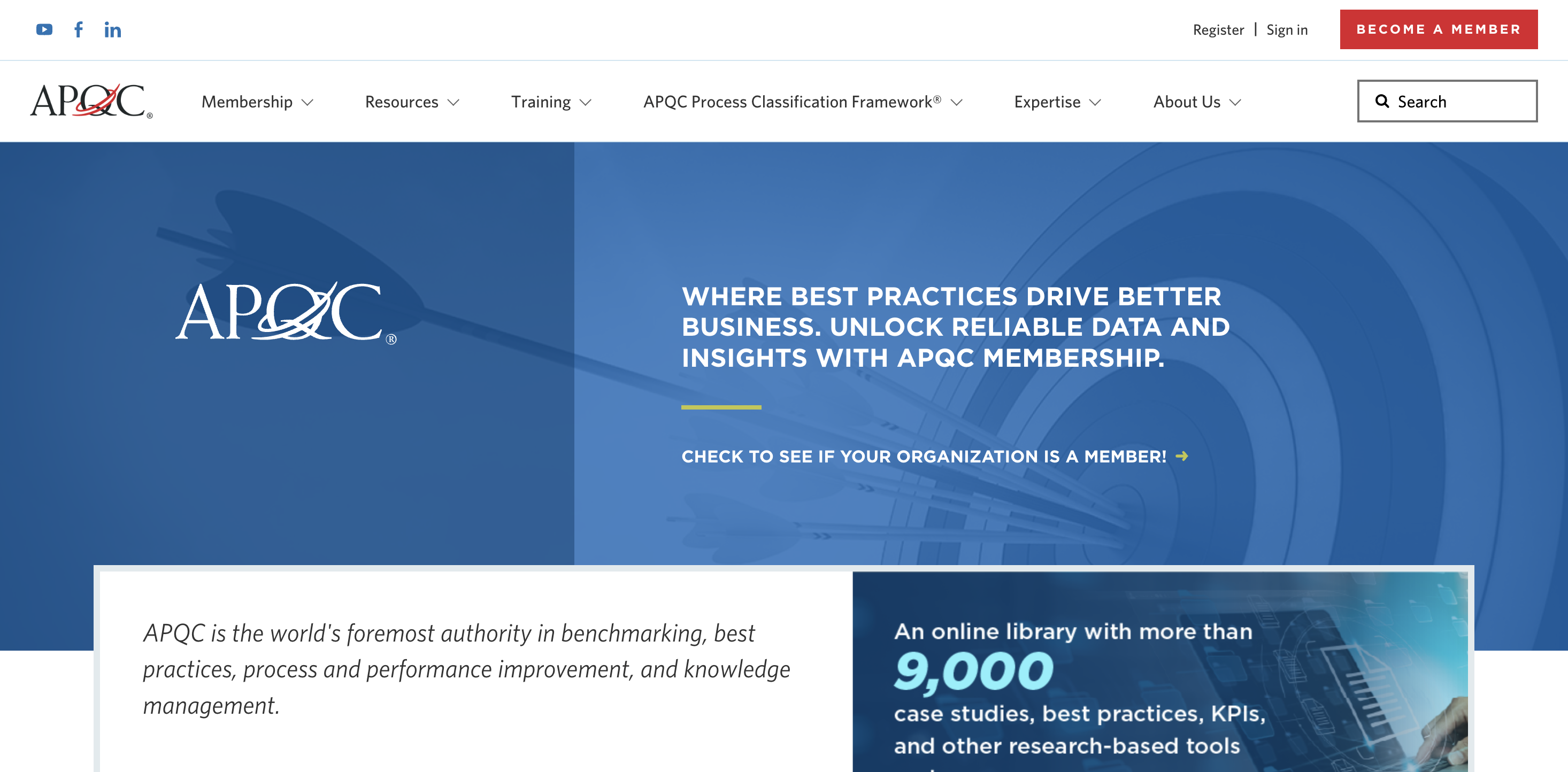
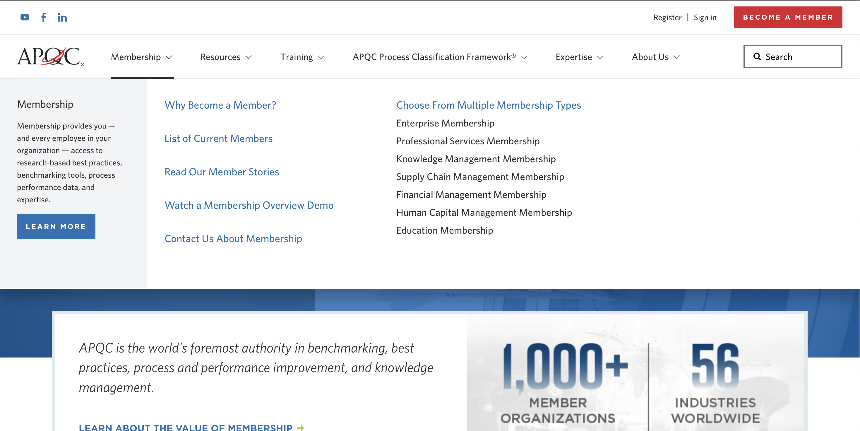
Clean, scannable navigation with clear hierarchy and visible search
Forms
Streamlined, customizable templates
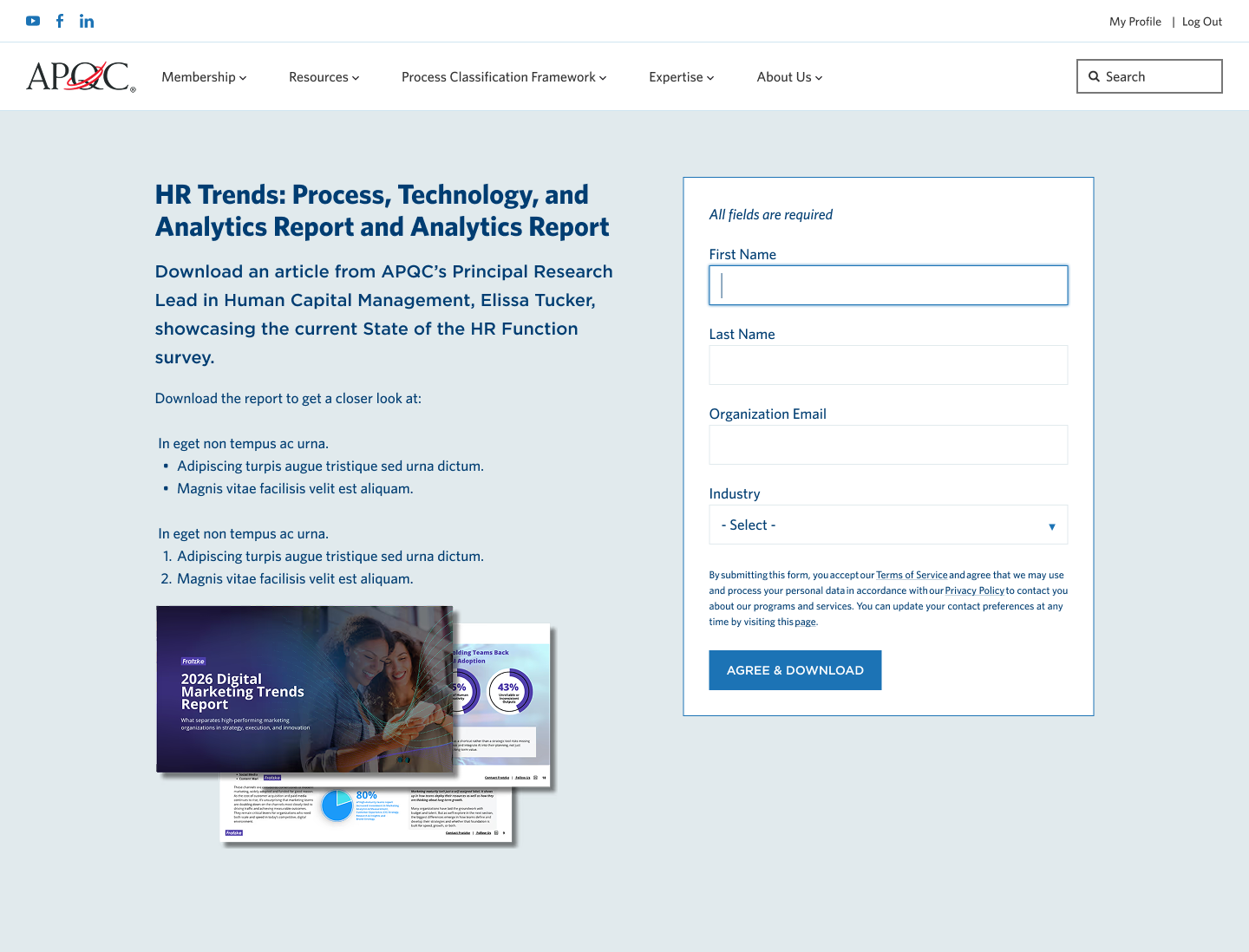
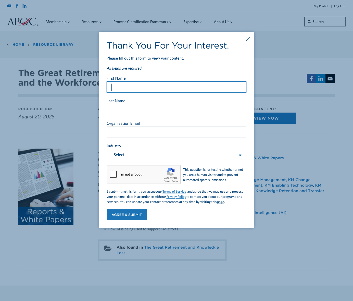
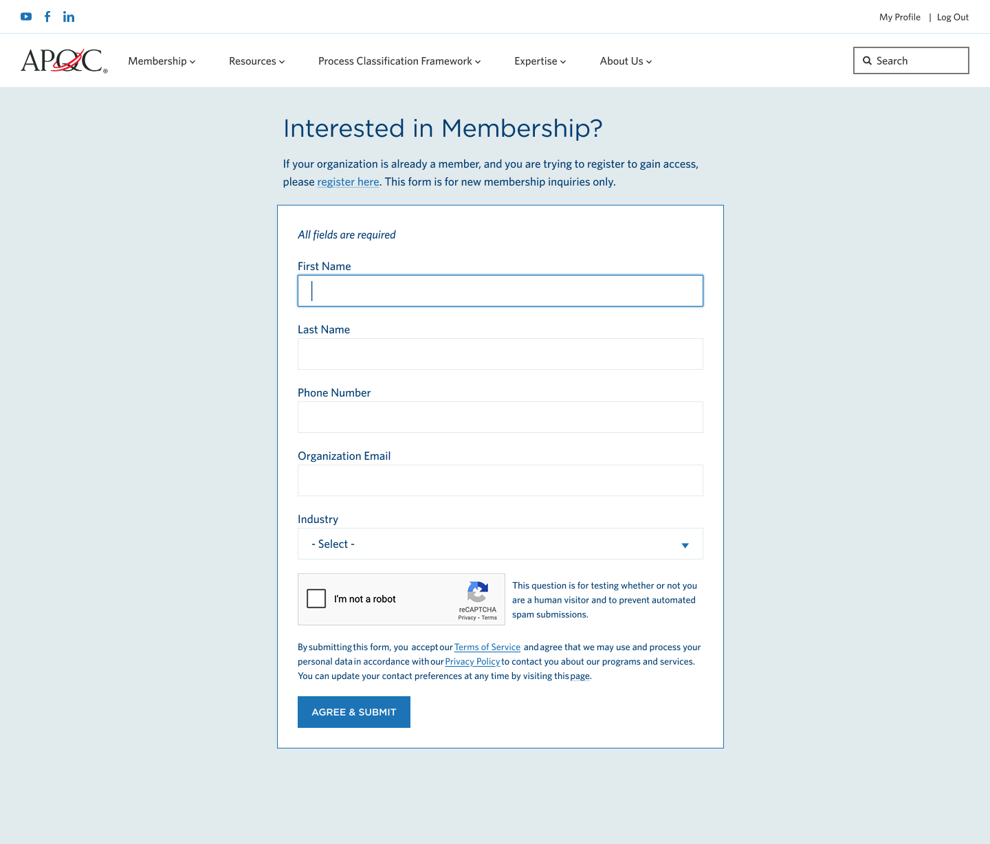
The forms system needed to support multiple use cases — membership sign-ups, lead magnet downloads,
contact requests, registration — while maintaining consistency and reducing whitespace. I created
flexible templates that work as full-page forms, popups, and embedded components.
Two-column layout with content on left, form on right, immediate PDF download on submit
Streamlined popup form with no scrolling, all fields above the fold
Two-step registration with password strength indicator and customized post-submit messaging
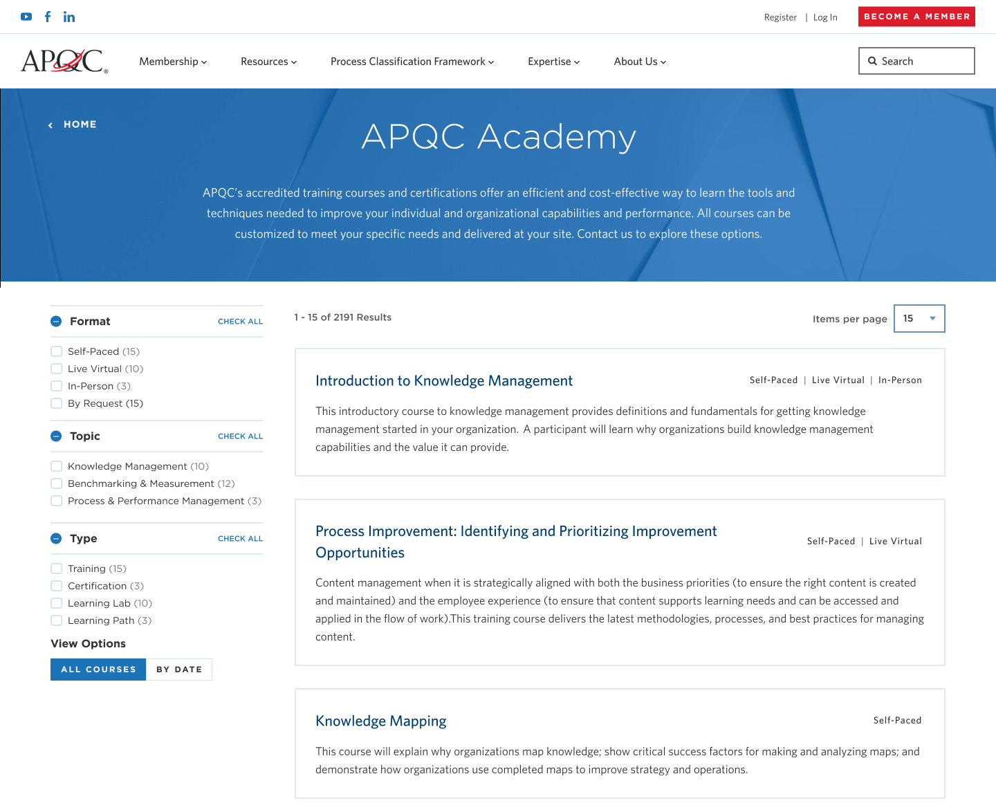
Course Catalog
Streamlined discovery and purchasing
We transformed how users discover and purchase APQC courses. The new catalog includes
filtering by format, topic, and type, plus detailed course pages with clear purchasing
options for members and non-members.
Users can filter by format (Self-Paced, Live Virtual, In-Person), topic, and course type
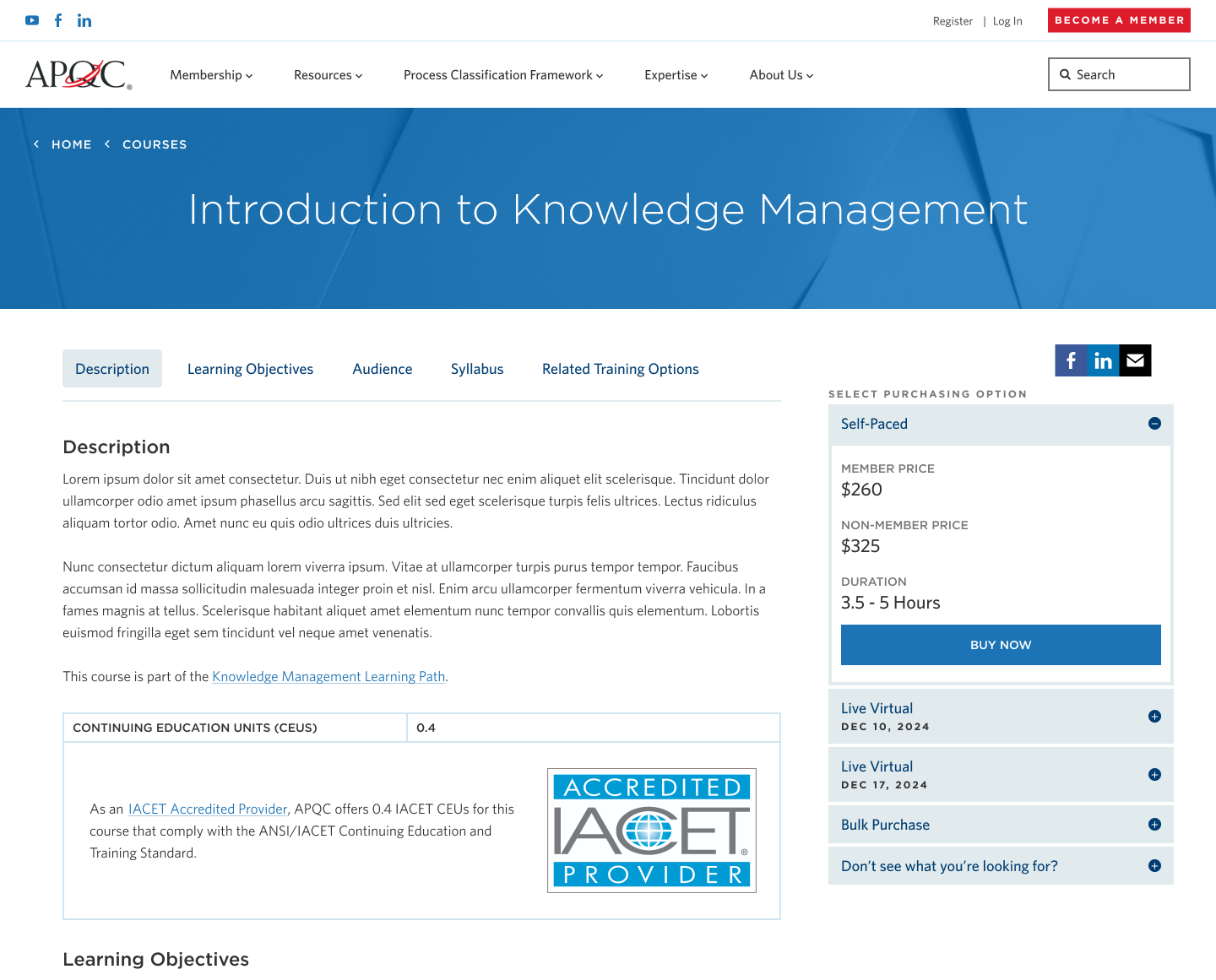
Detailed course pages with sticky purchasing options, learning objectives, and syllabus. Clear pricing for members vs non-members, with bulk and custom options
Outcomes
All three projects shipped
All three modernization projects successfully launched on APQC.org and are now serving
thousands of members daily. The work demonstrates the value of an embedded design partner
who can context-switch across different workstreams while maintaining design consistency.
🎯
Context-Switching Capability
Successfully delivered across three distinct projects — navigation systems, form templates,
and course discovery — demonstrating range and adaptability
♿
AA Accessibility
All projects meet WCAG AA standards, ensuring inclusive experiences for members of all abilities
✓
Validated with Users
Navigation tested with 5 participants (internal and external) — all successfully found content
with minimal effort
🚀
Foundation for Growth
Established design patterns and component library that APQC can extend for future projects
Takeaways
What I learned
This year-long engagement reinforced the value of embedded design partnerships for complex
organizations. APQC didn't need a specialist in navigation, or forms, or course catalogs —
they needed a designer who could jump between all three and maintain quality and consistency.
Lesson 01
The ability to context-switch between different types of design work — IA and navigation
systems, form UX, e-commerce flows — is more valuable than deep specialization in any one area.
Lesson 02
Working across multiple projects for the same client builds institutional knowledge that
makes each subsequent project faster and stronger. Patterns emerge, decisions compound.